Logo of the site

My cheatsheet

CSS cheatsheet

This is a quick reference cheat sheet for understanding and writing CSS files.

# Introduction

Inline & Internal Styling

CSS can be written directly in HTML using inline styles or within a <style> element inside the <head> tag (internal stylesheet).

Internal Stylesheet

Allows multiple rules to be defined in one place within <style> inside <head>. Better than inline, but not best practice.

<head>
  <style>
    p {
      color: red;
      font-size: 20px;
    }
  </style>
</head>

External Stylesheet

Linking a CSS file to an HTML file using the <link> element keeps styles modular and is considered best practice.

Required Attributes

  • href: Path or URL to the CSS file.
  • rel: Defines the relationship — should be stylesheet.

Example (URL)

<link href="https://www.codecademy.com/stylesheets/style.css" rel="stylesheet">

Example (Relative Path)

<link href="./style.css" rel="stylesheet">

# Selectors

Universal Selector

Targets all elements in the document.

* {
  font-family: Verdana;
}

Tag Selector

Targets all elements of a specific type (e.g., all <p> tags).

p {
  font-family: Verdana;
}

Class Selector

Targets elements with a specific class using . notation. Overrides tag selectors.

.brand {
  font-weight: bold;
}

ID Selector

Targets an element with a specific ID using #. IDs must be unique and override class selectors.

#large-title {
  font-size: 2rem;
}

Attribute Selector

Targets elements with a specific attribute or attribute value.

[href] {
  color: magenta;
}
img[src*='winter'] {
  color: lightgreen;
}
img[src*='summer'] {
  color: blue;
}

Chained Selectors

Combining selectors increases specificity. This targets only elements matching all conditions.

h1.special {
  font-weight: bold;
}

This targets only <h1> elements with class special. A <p class="special"> would not be affected.

Multiple Selectors

Apply the same rules to multiple selectors separated by commas.

h1, .menu {
  font-family: Georgia;
}

Descendant Selector

Targets elements nested inside others. The space indicates ancestry, not direct parent-child.

.main-list li {
  list-style: square;
}

This selects all <li> elements inside any element with class main-list.

Pseudo-class Selector

Targets element states (e.g., hover, visited, focus, active).

a {
  color: blue;
  cursor: pointer;
}
a:hover {
  color: orange;
}

Recommended Order

  • :link
  • :visited
  • :hover
  • :active

Pseudo-element Selector

Allows styling of specific parts of an element (e.g., ::before, ::after).

.breadcrumb li+li::before {
  padding: 10px;
  content: ">";
}

li+li selects adjacent siblings. ::before inserts content before the element.

Specificity

Specificity determines which CSS rule takes precedence when multiple selectors target the same element. The order of specificity, from lowest to highest, is: type selector (<h1>), class selector (.class), and ID selector (#id).

h1 {
  color: red;
}
.headline {
  color: firebrick;
}

In this example, the class .headline overrides the type h1 selector due to higher specificity.

Multiple Classes & Conflicts

An element can have multiple classes. If styles overlap, the most specific or the latest defined rule is applied.

.red {
  color: red;
}
.blue {
  color: blue;
}

If both classes are applied, the one defined last or more specifically wins. In this case, blue is applied.

# Box model

Box Model

Every element is a rectangular box composed of content, padding, border, and margin. The default model is content-box.

* {
  box-sizing: border-box;
}

Using border-box includes padding and borders in width and height calculations.

box model visual graph

Border & Border Radius

These properties define the visual edges and corners of an element's box.

  • border Specifies the width, style, and color of the element’s border (e.g. 3px solid black).
  • border-radius Rounds the corners of the element. Use border-radius: 50% to create a circle.
.box {
  border: 3px solid white;
  border-radius: 5px;
}
.circle {
  border-radius: 50%;
}

Padding

Space between content and border. Can accept 1 to 4 values.

padding: 5px 10px 20px;  /* top, left/right, bottom */
padding: 5px 10px;      /* top/bottom, left/right */

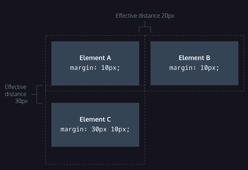
Margin & Margin Collapse

Margin defines the space outside an element’s border. It can also be used to center block elements horizontally.

  • margin Defines the outer space of an element. Example: margin: 0 auto centers a block element (requires defined width).
  • margin-collapse Vertical margins of adjacent elements collapse into a single margin (the largest one is applied).
div {
  width: 300px;
  margin: 0 auto;
}
margin collapse visual graph

Min/Max Dimensions

Restrict box resizing by defining min/max width or height.

min-width: 300px;
max-width: 600px;
min-height: 150px;
max-height: 300px;

Overflow

Controls how excess content is handled when it exceeds box limits.

  • visible: Default. Content overflows visibly.
  • hidden: Overflow is clipped.
  • scroll: Adds scrollbars.

Overflow works only when the element has a defined height or max-height.

Reset Defaults

Browsers apply default styles (user agent stylesheets). Reset them for consistency.

* {
  margin: 0;
  padding: 0;
}

Visibility

Controls whether an element is visible, hidden, or collapsed (for table elements).

  • visible: Element is shown (default).
  • hidden: Element is hidden but space remains.
  • collapse: Used in table elements to collapse row/column.

To remove the element and its space entirely, use display: none;.

Box Model: Visual Structure

The CSS box model consists of four main parts:

  • Content: The actual content (text, image, etc.)
  • Padding: Space between content and border
  • Border: Surrounds the padding
  • Margin: Outer space separating the element from others
.box {
  width: 200px;
  padding: 20px;
  border: 5px solid black;
  margin: 30px;
  box-sizing: border-box;
}

+---------------------------+  ← margin (30px)
|   +-------------------+   |  ← border (5px)
|   |   +-----------+   |   |  ← padding (20px)
|   |   |  content  |   |   |  ← width (200px)
|   |   +-----------+   |   |
|   +-------------------+   |
+---------------------------+

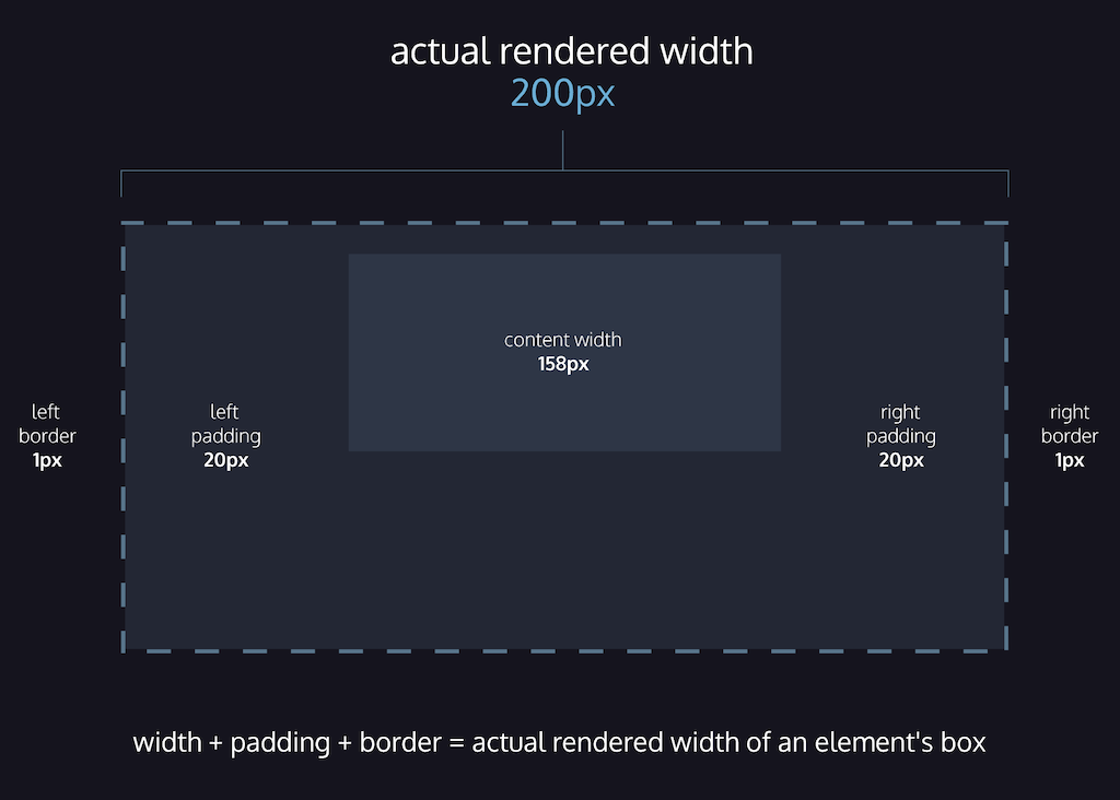
Box Model: content-box

content-box is the default box-sizing model in CSS. The declared width and height apply only to the content. Padding and border are added outside these dimensions, increasing the total size of the element.

div {
  box-sizing: content-box; /* default */
  width: 200px;
  padding: 20px;
  border: 2px solid black;
}
/* Final rendered width: 200 + 40 + 4 = 244px */

To include padding and borders inside the element's total size, use box-sizing: border-box; instead.

content-box visual graph

# Flow of HTML

Position

Controls how an element is placed within the document flow.

  • static Default positioning; element is in normal flow.
  • relative Offsets the element from its original position without affecting others.
  • absolute Removed from normal flow and positioned relative to the closest non-static ancestor.
  • fixed Removed from flow and fixed to the viewport even when scrolling.
  • sticky Behaves like relative until a threshold is reached, then acts like fixed.
.green-box {
  position: relative;
  top: 50px;
  left: 120px;
}

Z-Index

Controls the stack order of elements when overlapping. Only applies to positioned elements.

.element {
  position: absolute;
  z-index: 10;
}

Display

Defines how an element is displayed in the layout.

  • block Takes full width, starts on a new line. Width/height can be set.
  • inline Takes only the necessary space, stays in line. Width/height ignored.
  • inline-block Stays inline but accepts width and height. Useful for buttons or images.
h1 {
  display: inline;
}

Float & Clear

Float removes an element from normal flow and aligns it to the left or right. Clear prevents layout issues caused by floats.

  • float: left/right Moves the element to the left or right edge inside its container.
  • clear: left/right/both Prevents the element from sitting next to floated elements on that side.
div {
  float: left;
}

div.special {
  clear: left;
}

# Fonts

@font-face

To use downloaded fonts, place the font files in your project folder and define a @font-face rule in your CSS.

Recommended file formats (for compatibility):

  • .woff2 Optimized for web; small file size and good browser support.
  • .woff Web Open Font Format, supported by most modern browsers.
  • .ttf TrueType; older but widely supported format.
  • .otf OpenType; supports advanced typographic features.

Place font files in a fonts folder, and define the rule at the top of your CSS file:

@font-face {
  font-family: 'MyParagraphFont';
  src: url('fonts/Roboto.woff2') format('woff2'),
       url('fonts/Roboto.woff') format('woff'),
       url('fonts/Roboto.ttf') format('truetype');
}

The browser loads the first supported format. Font name can be custom and is used in font-family throughout the site.

More info on usage and priority: CSS-Tricks – Using @font-face

Font Stacks & Fallbacks

Font stacks allow you to define fallbacks in case the preferred font isn’t available on the client’s device.

h1 {
  font-family: Caslon, Georgia, 'Times New Roman', serif;
}

Web-safe fonts are typically used as the last fallback option.

Serif vs Sans-Serif

Serif fonts have small decorative strokes at the ends of letters. Common examples: Times New Roman, Georgia, Caslon.

Sans-serif fonts are cleaner, without strokes. Common examples: Roboto, Arial, Helvetica.

When choosing fonts, it's good practice to match the primary font with a similar fallback of the same type (serif or sans-serif) for consistent appearance.

Font Weight

Specifies how bold or light text appears. Can be keyword-based or numeric (100–900).

Check which weights are available for the font you’re using.

.left-section {
  font-weight: 700;
}

.right-section {
  font-weight: bold;
}

# Colors

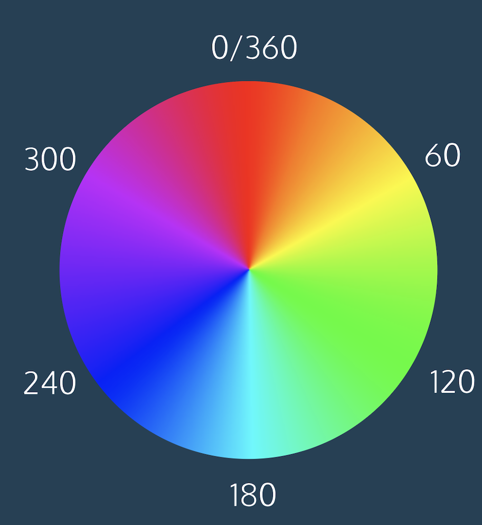
HSL

HSL stands for Hue, Saturation, and Lightness. Syntax: hsl(hue, saturation%, lightness%)

HSL is useful for adjusting color shades easily without affecting other values, unlike RGB.

  • Hue Angle on a color wheel from 0 to 360 (e.g., 0 = red, 120 = green, 240 = blue).
  • Saturation 0% is gray, 100% is full color.
  • Lightness 0% is black, 100% is white, 50% is normal color.
color: hsl(120, 60%, 70%);
HSL color wheel

HSLA

HSLA adds a fourth value: alpha (opacity) to the HSL model. Syntax: hsla(h, s%, l%, a)

Alpha is a value between 0 (transparent) and 1 (opaque).

color: hsla(34, 100%, 50%, 0.1);

You can also use the keyword transparent for full transparency.

RGBA

RGBA is the RGB color model with an added alpha (opacity) channel.

The first three values define red, green, and blue. The fourth defines transparency.

color: rgba(234, 45, 98, 0.33);

# Responsive Design

Relative Measurements

Use relative units like em, rem, and % to make layouts adapt to screen size.

  • emRelative to the element’s font-size or inherited font-size.
  • remRelative to the root element’s font-size (usually <html>).
  • %Relative to the parent element’s dimension.

Percentage Padding & Margin

When used for padding and margin, percentages are calculated from the parent's width.

Max/Min Width & Height

Use min-width, max-width, min-height, and max-height to limit element size regardless of screen.

Scaling Images and Videos

Use max-width: 100% and height: auto to scale media responsively inside containers.

.container img {
  max-width: 100%;
  height: auto;
  display: block;
}

Scaling Background Images

Use background-size: cover to scale background images responsively while maintaining proportion.

body {
  background-image: url('#');
  background-repeat: no-repeat;
  background-position: center;
  background-size: cover;
}

Viewport Meta Tag

Add this tag inside <head> to scale content correctly on mobile devices.

<meta name="viewport" content="width=device-width, initial-scale=1">

@media Queries

Apply CSS conditionally based on screen size, resolution, or orientation.

@media only screen and (max-width: 480px) {
  body {
    font-size: 12px;
  }
}

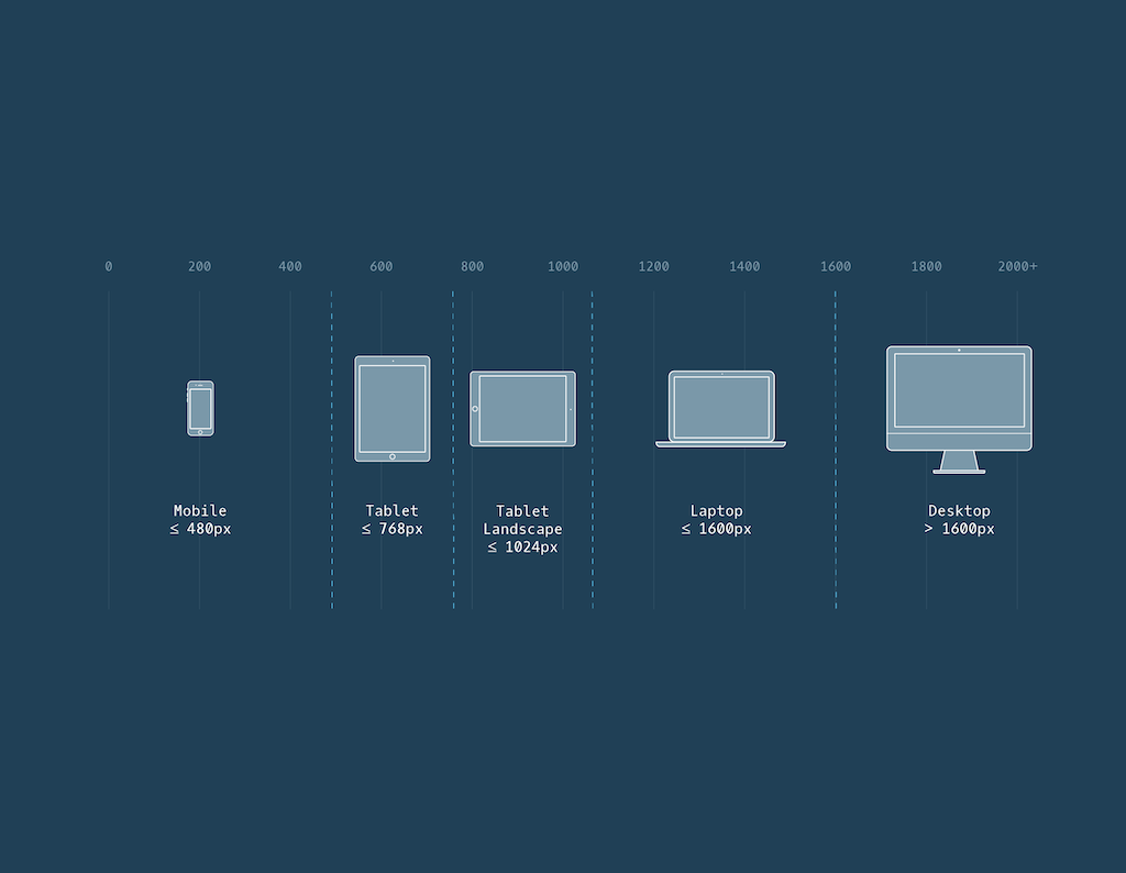
Breakpoints

Set breakpoints based on natural layout breaking points rather than device sizes.

Screen size breakpoints

DPI Targeting

Use min-resolution and max-resolution to apply styles for specific screen DPIs.

@media only screen and (min-resolution: 300dpi) {
  /* High-res styles */
}

Media Query Operators

  • andAll conditions must be true.
  • ,Any condition may be true.
@media only screen and (min-width: 480px), (orientation: landscape) {
  /* Responsive styles */
}

Viewport Units

Viewport units allow elements to scale based on the size of the visible browser window.

  • vw 1% of the viewport’s width. Useful for setting widths or font sizes that scale with the screen width.
  • vh 1% of the viewport’s height. Commonly used for full-height sections or modals.
  • vmin 1% of the smaller value between viewport height and width.
  • vmax 1% of the larger value between viewport height and width.
.hero {
  width: 100vw;
  height: 100vh;
  font-size: 5vmin;
}

# Flexbox

Flex Container

To define a flex container, set display: flex or display: inline-flex. All direct children become flex items.

  • display: flexCreates a block-level flex container.
  • display: inline-flexCreates an inline-level flex container.
.container {
  display: flex;
}

Flex container

justify-content

Aligns items along the main axis (horizontal by default).

  • flex-startItems align to the left.
  • flex-endItems align to the right.
  • centerItems center in the container.
  • space-betweenEqual spacing between items.
  • space-aroundEqual spacing around items (half space on edges).
  • space-evenlyEqual spacing before, between, and after items.
/* justify-content: space-between */
[Item1]   [Item2]   [Item3]

/* justify-content: space-around */
 [Item1]  [Item2]  [Item3]

/* justify-content: space-evenly */
  [Item1]   [Item2]   [Item3]

Flex container

align-items

Aligns items along the cross axis (vertical by default).

  • flex-startTop of container.
  • flex-endBottom of container.
  • centerCenter vertically.
  • baselineAlign text baselines.
  • stretchStretches items to fill the container (default).
/* align-items: center */
|        |
| Item1  |
| Item2  |
| Item3  |
|        |

Flex container

flex-grow

Controls how much a flex item grows relative to others.

.item1 { flex-grow: 1; }
.item2 { flex-grow: 2; }

/* Available space is distributed:
   [Item1]      [Item2 Item2] */

Flex item

flex-shrink

Defines how much a flex item shrinks when space is tight.

.item1 { flex-shrink: 1; }
.item2 { flex-shrink: 2; }

/* Item2 will shrink twice as fast as Item1 when necessary */

Flex item

flex-basis

Defines the initial main size of a flex item before grow/shrink.

.item {
  flex-basis: 200px;
}

Flex item

flex

Shorthand for flex-grow, flex-shrink, and flex-basis.

.item {
  flex: 1 1 100px;
}
/* = flex-grow: 1, flex-shrink: 1, flex-basis: 100px */

Flex item

flex-wrap

Specifies whether items wrap onto multiple lines.

  • nowrapSingle line (default).
  • wrapWraps onto multiple lines.
  • wrap-reverseWraps in reverse order.

Flex container

align-content

Aligns rows when there is extra vertical space.

  • flex-startRows packed at the top.
  • flex-endRows packed at the bottom.
  • centerRows centered vertically.
  • space-betweenEqual spacing between rows.
  • space-aroundEqual spacing around rows.
  • stretchRows stretch to fill container height.

Flex container

flex-direction

Defines the main axis direction in the flex container.

  • rowLeft to right (default).
  • row-reverseRight to left.
  • columnTop to bottom.
  • column-reverseBottom to top.

Flex container

flex-flow

Shorthand for flex-direction and flex-wrap.

.container {
  flex-flow: column wrap;
}

Flex container

Nested Flexboxes

Flex containers can be nested inside other flex items for complex layouts.

# Transitions

transition-property

Specifies which CSS property (or properties) should animate when changed. Accepts one or more comma-separated property names, or all to apply the same transition to every animatable property.

/* Animate only background-color and font-size */
a {
  transition-property: background-color, font-size;
}

/* Animate all animatable properties */
div {
  transition-property: all;
}

See the full list of animatable properties on MDN.

transition-duration

Sets how long the transition takes to complete. Required for a transition to occur. Units can be in s or ms.

/* Background changes in 1.5 seconds */
button {
  transition-property: background-color;
  transition-duration: 1.5s;
}

transition-timing-function

Controls how intermediate values are calculated for a transition. Common values:

  • easeStarts slow, accelerates, then slows again (default).
  • linearConstant speed from start to end.
  • ease-inStarts slow and speeds up.
  • ease-outStarts fast and slows down.
  • ease-in-outStarts and ends slowly.

The full list of values is available at MDN.

/* Smooth ease-out transition */
.box {
  transition: transform 1s ease-out;
}

/* Constant speed */
p {
  transition: color 1s linear;
}

transition-delay

Delays the start of the transition by a specific time (e.g. 300ms, 1s).

Default: 0s.

/* Wait 0.5s, then fade in */
.fade-in {
  opacity: 0;
  transition: opacity 1s ease-in;
  transition-delay: 0.5s;
}

Shorthand: transition

Combines all properties in one line:

transition: property duration timing-function delay;

Note: if delay is used, duration must be included first.

/* One transition with full declaration */
a {
  transition: color 1s ease-out 0.2s;
}

/* Multiple transitions */
div {
  transition: background-color 1s, transform 0.5s ease-in-out;
}

Multiple Transitions

You can define multiple transitions for different properties, each with its own duration, timing, and delay. Separate each group with a comma.

/* Each property has its own timing settings */
.button {
  transition:
    color 0.3s ease-in,
    background-color 0.5s ease-out 0.2s,
    transform 0.8s linear;
}

.button:hover {
  color: white;
  background-color: navy;
  transform: translateY(-3px);
}

transition: all

Applies the same transition timing to all animatable properties of an element. Useful when you want consistency across several property changes.

/* All properties will transition with the same speed/timing */
.card {
  transition: all 0.5s ease-in-out;
}

.card:hover {
  background-color: lightblue;
  transform: scale(1.05);
  border-radius: 10px;
}

Slide-Down and Fade-In Effect

This effect makes an element smoothly slide down from above and fade into view when hovered. It uses top and opacity transitions together.

.element {
  position: fixed;          /* or absolute, depending on layout */
  top: -100%;               /* Start above the viewport */
  opacity: 0;               /* Invisible initially */
  transition: top 0.5s ease-out, opacity 0.3s linear;
}

.element:hover {
  top: 0;                   /* Slide into view */
  opacity: 1;               /* Fade in */
}

# Buttons

Skeuomorphic Styling

Mimics real-life buttons with shadows and raised appearance to suggest interactivity.

button {
  padding: 5px;
  border: 1px solid black;
  border-radius: 5px;
  text-decoration: none;
  box-shadow: 0px 5px;
}

button:hover {
  cursor: pointer;
}

button:active {
  margin-top: 5px;
  color: black;
  box-shadow: 0px 0px;
}

Flat Design

Uses 2D design without mimicking physical buttons. Relies on simple styling and clear text labels for clarity.

Hover States

All button parts should respond to :hover and behave consistently when clicked or hovered.

Buttons: Clickability, Affordances & Signifiers

Clickability

Clicking is the core interaction on the web. Hypertext links established the web’s structure, and today users expect visual cues to indicate where clicks or taps will have an effect.

Affordances

Affordances are the potential interactions an object offers. For example, a bench affords sitting; a web button affords clicking. Even if a designer didn’t intend some behaviors, they may still be possible (e.g. dragging a loose bench).

Signifiers

Signifiers are the visual indicators that help users perceive possible actions. A button shape, underline, hover color, or cursor pointer are all examples. A teacup handle suggests where to hold it — that’s a signifier.

UX Patterns

UX patterns reuse familiar signifiers to reduce learning curves. For example, clickable links are often blue and underlined. Cursor styles (like the hand or I-beam) also signal expected actions. Without proper signifiers, users may miss interactive elements entirely — especially on mobile where no cursor hover exists.

Resources

See Signifiers, Not Affordances by Don Norman: https://jnd.org/signifiers-not-affordances/

Explore more at UI Patterns: https://ui-patterns.com/

# CSS Grid

Creating a Grid

To set up a grid, use a grid container and grid items. Set display: grid or display: inline-grid on the parent container.

.container {
  display: grid; /* or inline-grid */
}

Grid Container

Creating Columns & Rows

Define columns with grid-template-columns and rows with grid-template-rows.

.grid {
  display: grid;
  grid-template-columns: 100px 200px;
  grid-template-rows: 100px 50% 20px;
}

Grid Container

Explicit Grid

grid-template

Combines row and column definitions in one shorthand property.

.grid {
  grid-template: 200px 300px / 20% 10% 70%;
}

Grid Container

Explicit Grid

Fractional Unit (fr)

The fr unit divides remaining space among tracks.

.grid {
  grid-template-columns: 1fr 60px 1fr;
}

Grid Container

Explicit Grid

repeat()

Repeats column or row patterns.

.grid {
  grid-template-columns: repeat(2, 20px 50px);
}

Grid Container

Explicit Grid

minmax()

Sets a min and max size for grid tracks.

.grid {
  grid-template-columns: 100px minmax(100px, 500px) 100px;
}

Grid Container

Explicit Grid

gap / row-gap / column-gap

Sets space between grid items using gap, or separately for rows and columns.

.grid {
  gap: 20px 10px; /* row-gap column-gap */
}

Grid Container

Spanning Rows & Columns

Use grid-row and grid-column to make items span multiple tracks.

.item {
  grid-row: 1 / 3;
  grid-column: 2 / span 2;
}

Grid Item

grid-area

Shorthand for grid-row-start / column-start / row-end / column-end.

.item {
  grid-area: 2 / 3 / 4 / span 5;
}

Grid Item

grid-template-areas

Defines named areas of a grid layout and assigns items to them via grid-area.

.container {
  display: grid;
  grid-template-areas: "header header"
                       "nav nav"
                       "info services"
                       "footer footer";
  grid-template-columns: 1fr 3fr;
}

Grid Container

Explicit Grid

Implicit Grid & grid-auto

When content overflows the explicit grid, new rows/columns are created automatically. Use grid-auto-rows and grid-auto-columns to control their size.

body {
  display: grid;
  grid: repeat(2, 100px) / repeat(2, 150px);
  grid-auto-rows: 50px;
}

Grid Container

Implicit Grid

grid-auto-flow

Controls how auto-placed items are inserted: by row, column, or using dense packing.

body {
  display: grid;
  gap: 5px;
  grid: repeat(2, 100px) / repeat(2, 150px);
  grid-auto-rows: 45px;
  grid-auto-columns: 65px;
  grid-auto-flow: column;
}

Grid Container

Implicit Grid

# Utility

Image Formats

Common image file formats and their usage:

  • JPEGHighly compressible, preferred for images with significant detail.
  • PNGLossless, best for images like logos or graphics with fewer details.
  • SVGScalable Vector Graphics. Great for high-res screens, icons, and logos. Lighter and scalable.

Favicon

Favicons are small icons shown in the browser tab. You can generate one using favicon-generator.org.

Once created, save it in your project and link it in the <head>:

<link rel="icon" href="./<favicon-name>.ico" type="image/x-icon">

Edit and Crop Images

Use Pixlr to edit and crop images online quickly and for free.

Convert to SVG

To convert simple images to scalable SVG format, use online-convert.

SVG files are ideal for high-resolution scaling and optimized performance.